


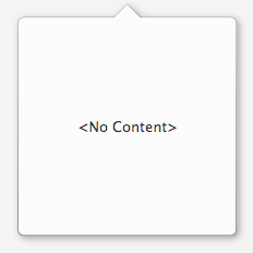
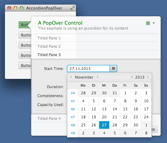
PopOver popOver = new PopOver();
popOver.getRoot().getStylesheets().add(...);
| Modifier and Type | Class and Description |
|---|---|
| public static enum | PopOver.
All possible arrow locations. |
| Modifier and Type | Field and Description |
|---|---|
| private final SimpleBooleanProperty | |
| private final DoubleProperty | |
| private final ObjectProperty | |
| private final DoubleProperty | |
| private final BooleanProperty | |
| private final WeakEventHandler | |
| private final EventHandler | |
| private final ObjectProperty | |
| private final DoubleProperty | |
| private static final Duration | |
| private static final String | |
| private final BooleanProperty | |
| private final BooleanProperty | |
| private final ObjectProperty | |
| private final ObjectProperty | |
| private final BooleanProperty | |
| private final InvalidationListener | |
| private Duration | |
| private Window | |
| private final StackPane | |
| private double | |
| private double | |
| private final StringProperty | |
| private final WeakInvalidationListener | |
| private final WeakChangeListener | |
| private final WeakChangeListener | |
| private final ChangeListener | |
| private final ChangeListener |
| Access | Constructor and Description |
|---|---|
| public | |
| public |
| Modifier and Type | Method and Description |
|---|---|
| private void | |
| public final BooleanProperty | |
| public final DoubleProperty | Returns: the arrow indent propertyControls the distance between the arrow and the corners of the pop over. |
| public final ObjectProperty | |
| public final DoubleProperty | |
| public final BooleanProperty | |
| private double | |
| private double | |
| public final ObjectProperty | |
| public final DoubleProperty | Returns: the corner radius property (default is 6)Returns the corner radius property for the pop over. |
| protected Skin | createDefaultSkin()
Overrides javafx. Create a new instance of the default skin for this control. |
| public final void | |
| public final BooleanProperty | |
| public final BooleanProperty | Returns: the detached propertyDetermines whether the pop over is detached from the owning node or not. |
| public final ObjectProperty | |
| public final ObjectProperty | |
| public final double | |
| public final PopOver. | Returns: the preferred arrow locationReturns the value of the arrow location property. |
| public final double | |
| public final Node | |
| public final double | |
| public final Duration | |
| public final Duration | Returns: the fade-out durationReturns the value of the fade-out duration property. |
| public final StackPane | |
| public final String | |
| public final BooleanProperty | headerAlwaysVisibleProperty()
Determines whether the |
| public final void | hide()
Overrides javafx. Hides the pop over by quickly changing its opacity to 0. |
| public final void | |
| public final boolean | Returns: true if the PopOver will be shown and hidden with a short fade animationReturns the value of the "animated" property. |
| public final boolean | Returns: true if the header's close button is enabledReturns the value of the closeButtonEnabled property. |
| public final boolean | Returns: true if the user is allowed to detach / tear off the pop overReturns the value of the detachable property. |
| public final boolean | Returns: true if the pop over is currently detached.Returns the value of the detached property. |
| public final boolean | Returns: true if the header is visible even while attachedReturns the value of the detachable property. |
| private void | |
| public final void | setAnimated(boolean
if true the PopOver will be shown and hidden with a short fade animation animated)Sets the value of the "animated" property. |
| public final void | |
| public final void | setArrowLocation(PopOver.
the requested location locationSets the value of the arrow location property. |
| public final void | setArrowSize(double
the new value of the arrow size property size)Sets the value of the arrow size property. |
| public final void | setCloseButtonEnabled(boolean
if false, the pop over will not be closeable by the header's close button enabled)Sets the value of the closeButtonEnabled property. |
| public final void | |
| public final void | |
| public final void | setDetachable(boolean
if true then the user can detach / tear off the pop over detachable)Sets the value of the detachable property. |
| public final void | setDetached(boolean
if true the pop over will change its apperance to "detached"
mode detached)Sets the value of the detached property. |
| public final void | setFadeInDuration(Duration
the requested fade-in duration duration)Sets the value of the fade-in duration property. |
| public final void | setFadeOutDuration(Duration
the requested fade-out duration duration)Sets the value of the fade-out duration property. |
| public final void | setHeaderAlwaysVisible(boolean
if true, then the header is visible even while attached visible)Sets the value of the headerAlwaysVisible property. |
| public final void | |
| public final void | |
| public final void | show(Node
the owner of the pop over owner, double if negative specifies the distance to the owner node or when
positive specifies the number of pixels that the arrow will
overlap with the owner node (positive values are recommended) offset)Shows the pop over in a position relative to the edges of the given owner node. |
| public final void | show(Node
the owning node owner, double the x coordinate for the pop over arrow tip x, double the y coordinate for the pop over arrow tip y, Duration the time it takes for the pop over to be fully visible. This duration takes precedence over the fade-in property without setting. fadeInDuration)Makes the pop over visible at the give location and associates it with the given owner node. |
| private void | |
| public final StringProperty |
| animated | back to summary |
|---|---|
| private final SimpleBooleanProperty animated | |
| arrowIndent | back to summary |
|---|---|
| private final DoubleProperty arrowIndent | |
| arrowLocation | back to summary |
|---|---|
| private final ObjectProperty<PopOver. | |
| arrowSize | back to summary |
|---|---|
| private final DoubleProperty arrowSize | |
| closeButtonEnabled | back to summary |
|---|---|
| private final BooleanProperty closeButtonEnabled | |
| closePopOverOnOwnerWindowClose | back to summary |
|---|---|
| private final WeakEventHandler<WindowEvent> closePopOverOnOwnerWindowClose | |
| closePopOverOnOwnerWindowCloseLambda | back to summary |
|---|---|
| private final EventHandler<WindowEvent> closePopOverOnOwnerWindowCloseLambda | |
| contentNode | back to summary |
|---|---|
| private final ObjectProperty<Node> contentNode | |
| cornerRadius | back to summary |
|---|---|
| private final DoubleProperty cornerRadius | |
| DEFAULT_FADE_DURATION | back to summary |
|---|---|
| private static final Duration DEFAULT_FADE_DURATION | |
| DEFAULT_STYLE_CLASS | back to summary |
|---|---|
| private static final String DEFAULT_STYLE_CLASS | |
| detachable | back to summary |
|---|---|
| private final BooleanProperty detachable | |
| detached | back to summary |
|---|---|
| private final BooleanProperty detached | |
| fadeInDuration | back to summary |
|---|---|
| private final ObjectProperty<Duration> fadeInDuration | |
| fadeOutDuration | back to summary |
|---|---|
| private final ObjectProperty<Duration> fadeOutDuration | |
| headerAlwaysVisible | back to summary |
|---|---|
| private final BooleanProperty headerAlwaysVisible | |
| hideListener | back to summary |
|---|---|
| private final InvalidationListener hideListener | |
| oneTimeFadeInDuration | back to summary |
|---|---|
| private Duration oneTimeFadeInDuration | |
| ownerWindow | back to summary |
|---|---|
| private Window ownerWindow | |
| root | back to summary |
|---|---|
| private final StackPane root | |
| targetX | back to summary |
|---|---|
| private double targetX | |
| targetY | back to summary |
|---|---|
| private double targetY | |
| title | back to summary |
|---|---|
| private final StringProperty title | |
| weakHideListener | back to summary |
|---|---|
| private final WeakInvalidationListener weakHideListener | |
| weakXListener | back to summary |
|---|---|
| private final WeakChangeListener<Number> weakXListener | |
| weakYListener | back to summary |
|---|---|
| private final WeakChangeListener<Number> weakYListener | |
| xListener | back to summary |
|---|---|
| private final ChangeListener<Number> xListener | |
| yListener | back to summary |
|---|---|
| private final ChangeListener<Number> yListener | |
| PopOver | back to summary |
|---|---|
| public PopOver() Creates a pop over with a label as the content node. | |
| PopOver | back to summary |
|---|---|
| public PopOver(Node content) Creates a pop over with the given node as the content node.
| |
| adjustWindowLocation | back to summary |
|---|---|
| private void adjustWindowLocation() | |
| animatedProperty | back to summary |
|---|---|
| public final BooleanProperty animatedProperty() Stores the "animated" flag. If true then the PopOver will be shown / hidden with a short fade in / out animation.
| |
| arrowIndentProperty | back to summary |
|---|---|
| public final DoubleProperty arrowIndentProperty() Controls the distance between the arrow and the corners of the pop over. The default value is 12.
| |
| arrowLocationProperty | back to summary |
|---|---|
| public final ObjectProperty Stores the preferred arrow location. This might not be the actual location of the arrow if auto fix is enabled.
| |
| arrowSizeProperty | back to summary |
|---|---|
| public final DoubleProperty arrowSizeProperty() Controls the size of the arrow. Default value is 12.
| |
| closeButtonEnabledProperty | back to summary |
|---|---|
| public final BooleanProperty closeButtonEnabledProperty() Determines whether the header's close button should be available. | |
| computeXOffset | back to summary |
|---|---|
| private double computeXOffset() | |
| computeYOffset | back to summary |
|---|---|
| private double computeYOffset() | |
| contentNodeProperty | back to summary |
|---|---|
| public final ObjectProperty Returns the content shown by the pop over.
| |
| cornerRadiusProperty | back to summary |
|---|---|
| public final DoubleProperty cornerRadiusProperty() Returns the corner radius property for the pop over.
| |
| createDefaultSkin | back to summary |
|---|---|
| protected Skin Overrides javafx. Doc from javafx. Create a new instance of the default skin for this control. This is called to create a skin for the control if
no skin is provided via CSS
| |
| detach | back to summary |
|---|---|
| public final void detach() Detaches the pop over from the owning node. The pop over will no longer display an arrow pointing at the owner node. | |
| detachableProperty | back to summary |
|---|---|
| public final BooleanProperty detachableProperty() Determines if the pop over is detachable at all. | |
| detachedProperty | back to summary |
|---|---|
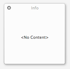
| public final BooleanProperty detachedProperty() Determines whether the pop over is detached from the owning node or not. A detached pop over no longer shows an arrow pointing at the owner and features its own title bar.
| |
| fadeInDurationProperty | back to summary |
|---|---|
| public final ObjectProperty Stores the fade-in duration. This should be set before calling PopOver.show(..).
| |
| fadeOutDurationProperty | back to summary |
|---|---|
| public final ObjectProperty Stores the fade-out duration.
| |
| getArrowIndent | back to summary |
|---|---|
| public final double getArrowIndent() Returns the value of the arrow indent property.
| |
| getArrowLocation | back to summary |
|---|---|
| public final PopOver. Returns the value of the arrow location property.
| |
| getArrowSize | back to summary |
|---|---|
| public final double getArrowSize() Returns the value of the arrow size property.
| |
| getContentNode | back to summary |
|---|---|
| public final Node getContentNode() Returns the value of the content property
| |
| getCornerRadius | back to summary |
|---|---|
| public final double getCornerRadius() Returns the value of the corner radius property.
| |
| getFadeInDuration | back to summary |
|---|---|
| public final Duration getFadeInDuration() Returns the value of the fade-in duration property.
| |
| getFadeOutDuration | back to summary |
|---|---|
| public final Duration getFadeOutDuration() Returns the value of the fade-out duration property.
| |
| getRoot | back to summary |
|---|---|
| public final StackPane getRoot() The root pane stores the content node of the popover. It is accessible via this method in order to support proper styling. Example:PopOver popOver = new PopOver(); popOver.getRoot().getStylesheets().add(...);
| |
| getTitle | back to summary |
|---|---|
| public final String getTitle() Returns the value of the title property.
| |
| headerAlwaysVisibleProperty | back to summary |
|---|---|
| public final BooleanProperty headerAlwaysVisibleProperty() Determines whether the | |
| hide | back to summary |
|---|---|
| public final void hide() Overrides javafx. Hides the pop over by quickly changing its opacity to 0.
| |
| hide | back to summary |
|---|---|
| public final void hide(Duration fadeOutDuration) Hides the pop over by quickly changing its opacity to 0.
| |
| isAnimated | back to summary |
|---|---|
| public final boolean isAnimated() Returns the value of the "animated" property.
| |
| isCloseButtonEnabled | back to summary |
|---|---|
| public final boolean isCloseButtonEnabled() Returns the value of the closeButtonEnabled property.
| |
| isDetachable | back to summary |
|---|---|
| public final boolean isDetachable() Returns the value of the detachable property.
| |
| isDetached | back to summary |
|---|---|
| public final boolean isDetached() Returns the value of the detached property.
| |
| isHeaderAlwaysVisible | back to summary |
|---|---|
| public final boolean isHeaderAlwaysVisible() Returns the value of the detachable property.
| |
| ownerWindowHiding | back to summary |
|---|---|
| private void ownerWindowHiding() | |
| setAnimated | back to summary |
|---|---|
| public final void setAnimated(boolean animated) Sets the value of the "animated" property.
| |
| setArrowIndent | back to summary |
|---|---|
| public final void setArrowIndent(double size) Sets the value of the arrow indent property.
| |
| setArrowLocation | back to summary |
|---|---|
| public final void setArrowLocation(PopOver. Sets the value of the arrow location property.
| |
| setArrowSize | back to summary |
|---|---|
| public final void setArrowSize(double size) Sets the value of the arrow size property.
| |
| setCloseButtonEnabled | back to summary |
|---|---|
| public final void setCloseButtonEnabled(boolean enabled) Sets the value of the closeButtonEnabled property.
| |
| setContentNode | back to summary |
|---|---|
| public final void setContentNode(Node content) Sets the value of the content property.
| |
| setCornerRadius | back to summary |
|---|---|
| public final void setCornerRadius(double radius) Sets the value of the corner radius property.
| |
| setDetachable | back to summary |
|---|---|
| public final void setDetachable(boolean detachable) Sets the value of the detachable property.
| |
| setDetached | back to summary |
|---|---|
| public final void setDetached(boolean detached) Sets the value of the detached property.
| |
| setFadeInDuration | back to summary |
|---|---|
| public final void setFadeInDuration(Duration duration) Sets the value of the fade-in duration property. This should be set before calling PopOver.show(..).
| |
| setFadeOutDuration | back to summary |
|---|---|
| public final void setFadeOutDuration(Duration duration) Sets the value of the fade-out duration property.
| |
| setHeaderAlwaysVisible | back to summary |
|---|---|
| public final void setHeaderAlwaysVisible(boolean visible) Sets the value of the headerAlwaysVisible property.
| |
| setTitle | back to summary |
|---|---|
| public final void setTitle(String title) Sets the value of the title property.
| |
| show | back to summary |
|---|---|
| public final void show(Node owner) Shows the pop over in a position relative to the edges of the given owner node. The position is dependent on the arrow location. If the arrow is pointing to the right then the pop over will be placed to the left of the given owner. If the arrow points up then the pop over will be placed below the given owner node. The arrow will slightly overlap with the owner node.
| |
| show | back to summary |
|---|---|
| public final void show(Node owner, double offset) Shows the pop over in a position relative to the edges of the given owner node. The position is dependent on the arrow location. If the arrow is pointing to the right then the pop over will be placed to the left of the given owner. If the arrow points up then the pop over will be placed below the given owner node.
| |
| show | back to summary |
|---|---|
| public final void show(Node owner, double x, double y, Duration fadeInDuration) Makes the pop over visible at the give location and associates it with the given owner node. The x and y coordinate will be the target location of the arrow of the pop over and not the location of the window. | |
| showFadeInAnimation | back to summary |
|---|---|
| private void showFadeInAnimation(Duration fadeInDuration) | |
| titleProperty | back to summary |
|---|---|
| public final StringProperty titleProperty() Stores the title to display in the PopOver's header.
| |
| Modifier and Type | Field and Description |
|---|---|
| public static final PopOver. | |
| public static final PopOver. | |
| public static final PopOver. | |
| public static final PopOver. | |
| public static final PopOver. | |
| public static final PopOver. | |
| public static final PopOver. | |
| public static final PopOver. | |
| public static final PopOver. | |
| public static final PopOver. | |
| public static final PopOver. | |
| public static final PopOver. |
| Access | Constructor and Description |
|---|---|
| private |
| Modifier and Type | Method and Description |
|---|---|
| public static PopOver. | |
| public static PopOver. |
| BOTTOM_CENTER | back to summary |
|---|---|
| public static final PopOver. | |
| BOTTOM_LEFT | back to summary |
|---|---|
| public static final PopOver. | |
| BOTTOM_RIGHT | back to summary |
|---|---|
| public static final PopOver. | |
| LEFT_BOTTOM | back to summary |
|---|---|
| public static final PopOver. | |
| LEFT_CENTER | back to summary |
|---|---|
| public static final PopOver. | |
| LEFT_TOP | back to summary |
|---|---|
| public static final PopOver. | |
| RIGHT_BOTTOM | back to summary |
|---|---|
| public static final PopOver. | |
| RIGHT_CENTER | back to summary |
|---|---|
| public static final PopOver. | |
| RIGHT_TOP | back to summary |
|---|---|
| public static final PopOver. | |
| TOP_CENTER | back to summary |
|---|---|
| public static final PopOver. | |
| TOP_LEFT | back to summary |
|---|---|
| public static final PopOver. | |
| TOP_RIGHT | back to summary |
|---|---|
| public static final PopOver. | |
| ArrowLocation | back to summary |
|---|---|
| private ArrowLocation() | |
| valueOf | back to summary |
|---|---|
| public static PopOver. | |
| values | back to summary |
|---|---|
| public static PopOver. | |